
SCSS Mixins explained simply
SCSS is a CSS preprocessor that allows you to write more efficient, structured and scalable CSS. The main features of SCSS include:
- Nesting: This makes it possible to nest and structure CSS rules, but also simply the CSS selectors. This provides the developer with a better overview of the styles and makes writing CSS rules more efficient.
- Variables: The advantage of variables is somewhat diminished since variables can also be used in CSS. Nevertheless, it is possible to set variables in SCSS that contain styles, which can then be reused in various places.
- Inheritance: It is possible to completely inherit styles from another CSS rule and extend them accordingly. This saves you having to define styles twice and you only maintain them in one place. This is a great advantage not only when initially writing the rules, but also for later extensions or adjustments.
- Mixins: This makes it possible to create reusable CSS rules / blocks. Mixins can also accept and process parameters. Mixins are described in more detail in the course of this article.
- Functions: SCSS itself comes with some useful functions. These can be used to calculate values dynamically. However, you also have the option of developing your own functions in SCSS. Functions are explained in more detail in this article.
In summary, SCSS brings the following advantages for development:
- Better organization / structuring: The main features mentioned above make it much easier to structure and modularize the code.
- More efficient maintenance and scalability: The use of mixins, functions and variables makes the code much easier to maintain and extend.
- Reusability: Using mixins and variables, you can define, maintain, extend and adapt styles in a central location and then reuse them in other places.
Mixins
A mixin is defined in SCSS with @mixin, followed by a unique name. You can then define and combine reusable styles in a mixin. The mixin can then be included at any point using @include.
The advantage of this is that you can manage certain styles that you need frequently in a central location and then use them everywhere. This avoids redundant code, creates flexibility and reduces maintenance work. For example, if you adjust a CSS rule in a mixin, this affects all rules that use the mixin via @include.
Examples of SCSS mixins
@mixin button($color, $padding: 8px) {
  background-color: $color;
  padding: $padding;
  border: none;
  border-radius: 4px;
}

.button--primary {
  @include button(#ff3300, 10px);
}

.button--secondary {
  @include button(#686868);
}
In the example code above, a mixin with the name “button” is defined. The mixin accepts the two parameters $color and $padding, where $padding is optional. If no value is passed for $padding, the default value is 8px. As you can see, $color is used to set a background color. A padding is set with $padding.
Under the definition of the mixin, it is included within two classes. The inclusion is done with @include, followed by the name (“button”) of the mixin. This means that the styles defined in the mixin are applied in each of the two classes.
A color value and a pixel value are transferred to the mixin in the button–primary class. This gives this class the corresponding color value as the background and the pixel value as the padding in the compiled CSS stylesheet. For the button–secondary class, the color value transferred there is set as the background. The spacing is not passed to the mixin here, so the padding property is given the default value of 8px, which is defined in the mixin.
The example above is a very simplified example of a mixin. These can often be much more complex and use different styles via if statements. A common use case is breakpoints, which are used to apply certain styles only to certain screen widths. The following code shows an example of a mixin that provides breakpoints:
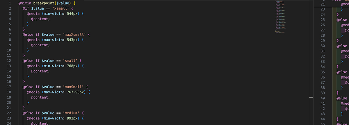
@mixin breakpoint($value) {
  @if $value == 'xsmall' {
    @media (min-width: 544px) {
      @content;
    }
  }
  @else if $value == 'maxXsmall' {
    @media (max-width: 543px) {
      @content;
    }
  }
  @else if $value == 'small' {
    @media (min-width: 768px) {
      @content;
    }
  }
  @else if $value == 'maxSmall' {
    @media (max-width: 767.98px) {
      @content;
    }
  }
  @else if $value == 'medium' {
    @media (min-width: 992px) {
      @content;
    }
  }
  @else if $value == 'maxMedium' {
    @media (max-width: 991.98px) {
      @content;
    }
  }
  @else if $value == 'large' {
    @media (min-width: 1232px) {
      @content;
    }
  }
  @else if $value == 'maxLarge' {
    @media (max-width: 1231.98px) {
      @content;
    }
  }
  @else if $value == 'xLarge' {
    @media (min-width: 2561px) {
      @content;
    }
  }
  @else if $value == 'maxXlarge' {
    @media (max-width: 2560.98px) {
      @content;
    }
  }
}

#burger-menu {
  @include breakpoint(medium) {
    display: none;
  }
}
In this example, you can see that the mixin must be passed a value ($value) that controls which media query is to be used. Under the definition of the mixin itself you can see an example of an integration of the mixin. There you can see that within the mixin, which is integrated with @include, further styles follow – in this case a display: none;. Within the mixin, @content ensures that exactly these style statements are placed instead of @content. This means that @content is a kind of placeholder or slot that is filled from the outside.
The example integration of the breakpoint mixin will look as follows when compiled in CSS:
@media (min-width: 992px) {
  #burger-menu {
    display: none;
  }
}
At first glance, you might think that the pure CSS notation is much less complex. Basically, this is correct because the mixin must first be written initially. However, the big advantage lies in the reusability on the one hand and the improved maintenance on the other.
Assuming you have distributed the styles modularly in various stylesheets, then you don’t have to remember all the breakpoints or keep copying them from other places. You only need to know the definitions such as “medium”, “small”, etc.. The exact pixel values behind them are not important when implementing new styles, as they are managed centrally. This is also a major advantage when maintaining or adapting such breakpoints. If there is a need to adjust pixel values for the breakpoints, this only needs to be done centrally in the mixin. The adjustments (changed pixel values) affect all places in the code that use this mixin. The effort is therefore greatly reduced at this point.
Conclusion on SCSS Mixins
SCSS mixins offer reusable code. This makes it easier for developers, especially when further developing systems, to always use certain styles (e.g. button styles) in different CSS rules without having to remember every style specification within the mixin. This speeds up development considerably.
In addition, adjustments to style specifications that are included in mixins are quickly implemented system-wide. You simply adjust the styling in the mixin and it affects all elements that use this mixin.
By the way, we have been using SCSS for years and have already written countless mixins – both complex and simple. However, SCSS mixins are only a fraction of what we have already implemented with SCSS and modular, structured and efficient styles. Feel free to contact us and let’s talk about your web project & the possibilities – whether you need a new system or want to improve the structure of an existing system.
Overview of Web development