
SCSS Functions explained simply
SCSS is a CSS preprocessor that allows you to write more efficient, structured and scalable CSS. The main features of SCSS include:
- Nesting: This makes it possible to nest and structure CSS rules, but also simply the CSS selectors. This provides the developer with a better overview of the styles and makes writing CSS rules more efficient.
- Variables: The advantage of variables is somewhat diminished since variables can also be used in CSS. Nevertheless, it is possible to set variables in SCSS that contain styles, which can then be reused in various places.
- Inheritance: It is possible to completely inherit styles from another CSS rule and extend them accordingly. This saves you having to define styles twice and you only maintain them in one place. This is a great advantage not only when initially writing the rules, but also for later extensions or adjustments.
- Mixins: This makes it possible to create reusable CSS rules / blocks. Mixins can also accept and process parameters. Mixins are explained in more detail in this article.
- Functions: SCSS itself comes with some useful functions. These can be used to calculate values dynamically. However, you also have the option of developing your own functions in SCSS. Functions are described in more detail in the course of this article.
In summary, SCSS brings the following advantages for development:
- Better organization / structuring: The main features mentioned above make it much easier to structure and modularize the code.
- More efficient maintenance and scalability: The use of mixins, functions and variables makes the code much easier to maintain and extend.
- Reusability: Using mixins and variables, you can define, maintain, extend and adapt styles in a central location and then reuse them in other places.
Functions
SCSS functions are defined with @function followed by a unique name. The name of the function can then be used to execute it anywhere.
Basically, SCSS Functions are similar to SCSS Mixins. They can accept parameters and perform calculations. However, unlike a mixin, a function does not return styles, but a value.
The advantage of functions is that you only have to create some complex calculations, which you need again and again within various CSS rules, once initially and can reuse them everywhere. This reduces the effort required to implement styles that are based on these calculations. In addition, maintenance is significantly simplified because you do not have to change anything in countless places in the event of any adjustments or extensions, but only centrally within the function. These changes then affect all places where the function is called.
SCSS already offers some useful functions of its own, such as lighten() & darken(). Both functions are used to change an entered color value by a certain percentage – either lighter or darker. The following example shows how the background color of a button is made 10% lighter (than the color value passed to it) using the lighten() function of SCSS:
$color: #343434;

.button--inactive {
  background-color: lighten($color, 10%);
}
Examples of custom SCSS functions
In addition to the functions already available in SCSS, you can also define your own functions. As mentioned above, this is done with @function, followed by a unique name. Here is a simple example of a custom function:
@function calcpercentage($value, $total) {
  @return ($value / $total) * 100%;
}

.image {
  width: calcpercentage(200px, 500px);
}
In the above example, a function “calcpercentage” is created. This accepts two parameters ($value & $total). With @return, a function returns the result to the place from which it is called. In the above example, the return is a percentage. The function is therefore passed the basic value ($total) and the percentage value ($value). The percentage is then calculated within the function and returned as the result with @return.
The example above is a simplified example of a function. These can also be more complex. The following example is still a fairly simple function, but in comparison to the first example it shows the complexity that a function can take:
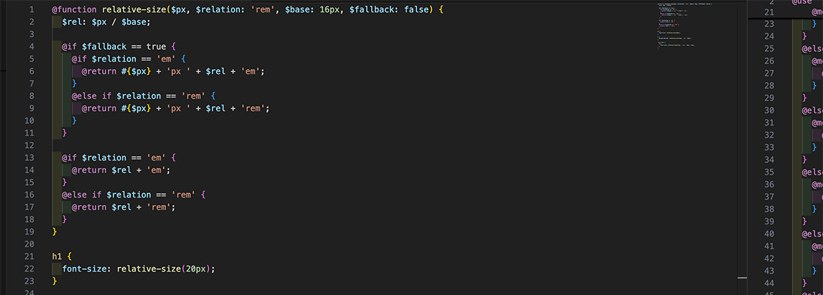
@function relative-size($px, $relation: 'rem', $base: 16px, $fallback: false) {
  $rel: $px / $base;

  @if $fallback == true {
    @if $relation == 'em' {
      @return #{$px} + 'px ' + $rel + 'em';
    }
    @else if $relation == 'rem' {
      @return #{$px} + 'px ' + $rel + 'rem';
    }
  }

  @if $relation == 'em' {
    @return $rel + 'em';
  }
  @else if $relation == 'rem' {
    @return $rel + 'rem';
  }
}

h1 {
  font-size: relative-size(20px);
}

p {
  margin-bottom: relative-size(16px, 'em', 20px);
}

.my-class {
  p {
    font-size: relative-size(12px, 'rem', 18px, true);
  }
}
In this example, the function “relative-size” is created, which ensures that a transferred target pixel value is converted into a relative value (rem / em) and returned. The function can accept four parameters:
- $px = target pixel value
- $relation = Optional, specifies whether em or rem should be used for the return – the default (if nothing is passed) is rem
- $base = Optional, you can pass a base value for the calculation and thus have more flexibility when using the function, the default (if nothing is passed) is 16px
- $fallback = Optional, specifies whether the target pixel value should be included as a fallback in the return value or not, the default (if nothing is passed) is false
Under the function definition, you can see three examples of how the function is used. In the first case, a relative font size is set. Only the target value is passed. The function calculates a relative value to the standard base (16px) and returns the relative value in rem as the result.
In the second application example, a relative distance is set at the bottom. In addition to ’em’ as the relation unit, a different base (20px) is also passed. In this case, the function returns a relative value in em for the target value of 16px and the base of 20px.
The third example above shows the use of all parameters. Here again a relative font size is returned. In this case, the function calculates a rem value for 12px and a base of 18px. The function returns the value of 12px as a fallback value.
Conclusion on SCSS Functions
SCSS Functions offer reusable calculations. This makes it easier for developers to use certain calculations in different CSS rules without having to memorize the exact calculation. This speeds up development considerably and also avoids errors in the calculation, as it is always the same.
In addition, adjustments to the calculation that a function contains are quickly implemented system-wide. You simply adjust the calculation centrally at one point in the function and it affects all elements that execute this function.
By the way, we have been using SCSS for years and have already written countless functions – both complex and simple. However, SCSS functions are only a fraction of what we have already implemented with SCSS and modular, structured and efficient styles. Feel free to contact us and let’s talk about your web project & the possibilities – whether you need a new system or want to improve the structure of an existing system.
Overview of Web development