
Pagespeed – the speed of a website – is becoming increasingly important these days. Many companies are investing heavily and constantly in improving the speed of their website. But what do the individual pagespeed key figures actually mean and why is a good pagespeed value so important?
Why is a good pagespeed value important?
A good pagespeed value is important for user satisfaction and for the visibility of the website in search engines. Ultimately, a good pagespeed value is therefore also an important factor in the success of a website.
A slow website can cause frustration and annoyance for the user and thus cause the user to leave the website. A fast website, on the other hand, increases the user’s satisfaction as it enables them to use the site quickly and smoothly.
The algorithms of search engines therefore also favour fast websites over slower functioning pages. A better pagespeed value therefore has a positive effect on search engine rankings. Google has even confirmed the pagespeed value as a ranking factor. Of course, the speed of a website alone is no guarantee of a high ranking, but the chances of appearing higher up in search results increase with a high speed of the website.
As mentioned above, a good pagespeed value increases user satisfaction. This means that the user is more inclined to stay on the website, explore it, consume content or perform actions on the website – such as contacting the company or making a purchase. This means that a good pagespeed value also has a positive influence on the conversion rate of the website. This is particularly true for users of mobile devices. The trend is increasingly moving towards surfing via mobile devices. Mobile devices often have a slower connection, so it is important that the website is optimised in terms of pagespeed. Most users decide after a few seconds whether to stay on a page or leave it because it is too slow.
To summarise, a good pagespeed value increases user satisfaction, supports a better ranking in search engines and can improve the conversion rate.
What key figures are there?
Google changes its key figures from time to time. This is not done to annoy website operators, but to meet the needs of search engine users. These also change over time and Google responds to this by making adjustments to the ranking factors and thus, among other things, by making adjustments to the pagespeed key figures.
At the time of writing this article, the following key figures are available, which are described in more detail later in the article:
- LCP – Largest Contentful Paint
- INP – Interaction to Next Paint
- CLS – Comulative Layout Shift
- FCP – First Contentful Paint
- TTFB – Time to First Byte
- FID – First Input Dely (is still occasionally listed, but was replaced by the INP in March 2024).
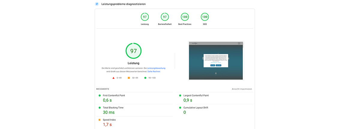
The above key figures are based on real user data and a 28-day survey period. Furthermore, Pagespeed Insights (https://pagespeed.web.dev/) also diagnoses performance problems (using Lighthouse). Google differentiates between the following categories
- Performance
- Accessibility
- Best Practice
- SEO
The categories “Accessibility”, “Best practice” and “SEO” are not subdivided further. Instead, the diagnostic results show directly under these categories which tests have been passed or failed. Google also usually refers to documentation describing possible optimisation measures in the individual test points.
The “Performance” category is subdivided into the following key figures (some of which also correspond to the above-mentioned key figures on real user data):
- FCP – First Contentful Paint
- LCP – Largest Contentful Paint
- TBT – Total Blocking Time
- CLS – Cumulative Layout Shift
- Speed Index
Remark: If you run a diagnosis in Pagespeed Insights, you may not see the above-mentioned key figures based on real user data (LCP, INP, CLS, FCP, TTFB, FID), but only the key figures from the diagnosis of performance problems (Lighthouse) described further. This may be due to the fact that the tested website is either new and does not yet have the corresponding data, or that the traffic on the website is too low for Google to carry out a meaningful analysis with real user data.
What do the individual key figures mean?
Basically, the individual key figures are divided into various tests and measurements. Listing these down to the smallest detail and, if necessary, describing threshold values and optimisation measures would go far beyond the scope of this article. Nevertheless, the individual “upper categories” and “upper key figures” mentioned in the previous section are explained below.
The “Performance” category
The measurements in this category relate to the actual performance of a website. This includes, for example, server loading times, how long it takes for the styling to be rendered by the browser, how long it takes for the user to be able to use the page, how long JavaScript code may block the page, how much “unnecessary” code is loaded by the server and much more. The individual key figures in this category are discussed in more detail further down in the article.
The “Accessibility” category
As the name of the category suggests, this is about accessibility. In other words, it measures how well the site can be used by users with disabilities (e.g. visual impairment). Topics such as special “hidden” attributes that help users who use voice output for support are evaluated here. The evaluation criteria also include colours and contrasts as well as keyboard control.
The “Best Practice” category
This category shows how well a website adheres to “best practices”, i.e. how well it meets the technical standards expected of a website. This includes topics such as the use of HTTPS, the avoidance of outdated APIs, the avoidance of third-party cookies, the provision of images in an appropriate resolution and much more.
The “SEO” category
In the “SEO” category, measures relating to the technical search engine optimisation of a website are evaluated. It is therefore tested whether a website can be indexed, for example, whether it has appropriate, general and specific (e.g. alternative text attributes for images that cannot be loaded) attributes that can be analysed and taken into account by search engines, whether there is a valid robots.txt that guides the crawler through the subpages, etc..
LCP – Largest Contentful Paint
This key figure measures the rendering time of the largest image or text block in the visible area of the website. The measurement therefore runs from the first time the website is called up by the user to the finished display of the largest element in the visible area. The visible area is the area that the user can see when calling up the website – without further scrolling, etc..
When measuring the LCP, the following elements are taken into account for the reaction time:
- Image elements (img-tags and image-tags within a scalable vector graphic (SVG)).
- Video elements (video-tags).
- Elements where a background image is integrated via CSS (url()-function).
- Block elements with texts or subordinate text elements.
However, heuristics are also used to exclude certain elements that are unlikely to be relevant to the user:
- Elements that are not visible to the user because they have an opacity of 0.
- Elements that are probably background elements and cover the entire display area.
- Images with a low entropy and placeholder images that probably do not reflect the actual content of the website.
In most cases, an LCP value that requires improvement is caused by image or video elements. Lighthouse displays the LCP element in the detailed diagnostic reports so that the cause can be easily identified and eliminated.
If the cause of a poor LCP value is an image, the timing can be divided into the following phases:
- Time to First Byte (TTFB – see corresponding section further down in the article).
- Loading delay: This describes a deviation between the TTFB and the time at which the browser starts loading the resource that causes the poor LCP value.
- Loading time: This phase indicates the actual time required to load the resource.
- Rendering delay: In this phase, the deviation is measured that exists between the completion of the loading process of the resource and the complete display (rendering) for the user.
So if you want to improve the LCP value, the above-mentioned phases are typically the areas in which you should optimise. However, the causes for the individual times in the above-mentioned phases can be very diverse and often need to be analysed in more detail first. For example, a slow server can be just as decisive as an image file that is too large.
Here you can find more information on the “LCP – Largest Contentful Paint” key figure: https://web.dev/articles/lcp#what-is-lcp
INP – Interaction to Next Paint
INP (Interaction to Next Paint) is used to measure the responsiveness of a website. This measurement is based on data in which the latency of all click, tap and keyboard actions is observed over the entire lifetime of a website. The longest duration is reported, but outliers are ignored. This means that when a user arrives on the website, the interactions (clicks, taps, keystrokes) are measured for as long as he is on the website.
A better INP value therefore means that a website consistently responds quickly to most user interactions. This reaction takes the form of visual feedback. For example, if users click on a menu or add an item to the shopping basket, they receive visual feedback on the website – the menu opens or a message is displayed that says, that the item has been added to the shopping basket.
The INP does not necessarily evaluate the “end results” of an interaction, but actually the visual feedback for the user. Some interactions take longer, such as logging into a protected area. In this example, it is important that the user receives visual feedback that his action is being processed as soon as he starts the interaction (click on the login button). This can also be a loading bar or spinner, for example.
It is often difficult to identify a clear cause for a poor INP value. There are many different ways to play through the use of the website and measure it at the same time. External factors (e.g. hardware used and its speed, browser (version)) also play a role and can influence the measurement results. In Pagespeed Insights, this key figure – at the time of writing this article – is only shown in the diagnostics using field data. Accordingly, it makes sense to implement technical measurements in the website that also collect field data over a certain period of time. In this way, causal interactions can be better and more clearly identified and rectified.
Further information on the “INP – Interaction to Next Paint” key figure can be found here: https://web.dev/articles/inp
CLS – Cumulative Layout Shift
This key figure measures unexpected layout shifts that occur during the lifetime of a website. More precisely, the highest score from a session window is shown.
What does that mean? – First of all, you need to know: A layout shift means that content in the visible area of the website is subsequently shifted after the initial display. This occurs, for example, when additional content is inserted before / between content that is already displayed (e.g. adverts). A shift can also be caused by the rendering of images where the size of the image or the area in which the image is displayed is unknown before the image is loaded. If, for example, an image is loaded that is 100 pixels high, but this area was not provided by white space or placeholders in the page content before loading, then a layout shift occurs after the image has been loaded and displayed. The image is inserted in the corresponding area and the subsequent content moves down by 100 pixels in this example.
A “session window” is the summary of several layout shifts that take place one after the other. If more than one second elapses between two layout shifts, this is the end of one session window and the start of the other. This means that a session window always includes the layout shifts up to the next gap of one or more seconds. Within the session window, all individual shifts are assigned scores, which are calculated on the basis of various factors. All scores of a session window are then totalled and form the score of a session window. As mentioned above, the CLS value provides information about the largest score of such a session window.
This described clustering helps to better identify and eliminate the cause of a poor CLS value in detailed analyses.
Further information on the “CLS – Cumulative Layout Shift” key figure can be found here: https://web.dev/articles/cls?hl=de
FCP – First Contentful Paint
Weiter oben in diesem Beitrag wurde bereits der LCP (Largest Contentful Paint) näher beschrieben. Der FCP (First Contentful Paint) funktioniert ähnlich, unterscheidet sich aber vom LCP dadurch, dass nicht der gesamte Inhalt gerendert wird, sondern nur das erste Inhaltselement. Es wird also die Zeit vom ersten Aufruf der Webseite bis zum Zeitpunkt, an dem der Nutzer die ersten Seiteninhalte sehen kann, gemessen.
Möchte die Ursache für einen schlechten FCP-Wert tiefer analysieren und identifizieren, dann bietet es sich an, dafür entsprechende Felddaten zu sammeln. Denn der FCP umfasst auch die Entladezeit der vorherigen Seite, die Zeit für Verbindungseinrichtungen, Weiterleitungszeiten und die Time to Frist Byte (TTFB). Diese Werte können sich bei Labormessungen unterscheiden.
Further information on the “FCP – First Contentful Paint” key figure can be found here: https://web.dev/articles/cls
TTFB – Time to First Byte
This key figure measures the connection setup time and the response time of the web server. In other words, it measures how much time elapses between the request for a resource and the arrival of the first byte of the response from the server.
A poor TTFB value is therefore an indication that the web server is too slow. This can be due to hardware, but also due to complex code that has to be processed on the web server before a response is sent. Existing caching mechanisms or a lack of server-side caching as well as the complexity of database queries or drive searches on the server can also influence the TTFB accordingly.
The TTFB is the sum of the following phases of an enquiry:
- Forwarding time
- Service worker start time – when service workers are in use
- DNS-Lookup
- Connection and TLS negotiation
- Request until the first byte of the response is available.
It should be noted that a good (low) TTFB is not absolutely necessary. Rather, it depends on how the underlying website functions. The TTFB is upstream of user-orientated key figures (LCP and FCP). A high TTFB can therefore have a negative impact on these user-orientated key figures. However, this does not necessarily have to be the case. For example, the LCP and FCP values of a website – with a higher TTFB – that is rendered on the server and requires little client-side logic (especially JavaScript) can be better than those of a website that is rendered on the client side (and whose TTFB is lower).
Further information on the “TTFB – Time to First Byte” key figure can be found here: https://web.dev/articles/ttfb
TBT – Total Blocking Time
The Total Blocking Time (TBT) measures the time between the FCP (see description above in the article) and the Time to Interactive. The “Time to Interactive” is the time at which the users can make their first user input (mouse clicks, keystrokes, etc.) without these user interactions being blocked by the execution of other work in the browser.
To calculate the TBT, only long tasks that take more than 50 milliseconds to process are taken into account. Only the blocking part of these tasks is shown in the diagnostic result, not the 50 milliseconds beforehand. For example: If a task blocks the browser for 80 milliseconds and thus prevents the user from further interaction for 80 milliseconds, then 30 milliseconds are shown as TBT (80 milliseconds processing time – 50 milliseconds up to the threshold = 30 milliseconds TBT).
Causes for a poor TBT value are often unnecessary JavaScript code that is not needed at all when loading the page, but still has to be loaded, parsed and executed in the browser’s main thread, or inefficient JavaScript instructions. If, for example, DOM elements are searched for and influenced with JavaScript instructions, but the search is too general and not limited to one area of the page in the best possible way, this can already worsen the TBT.
So if you want to improve the TBT, there is usually no way around a detailed analysis / refactoring of your JavaScript code. The aim is to identify unnecessary and inefficient code that needs to be removed, loaded asynchronously (if required later on the website), outsourced to a secondary thread (web worker) or rewritten efficiently.
Here you can find more information on the “TBT – Total Blocking Time” key figure: https://developer.chrome.com/docs/lighthouse/performance/lighthouse-total-blocking-time?utm_source=lighthouse&utm_medium=lr
Speed Index
This performance indicator provides information on how long it takes for page content to be displayed visually when the website is being built. To do this, Lighthouse records a video of the entire page structure and then calculates the progress between the individual frames of this video.
There are no specific measures for analysing this key figure in depth or for improving it. Rather, all the performance indicators described above have an effect on the speed index. If, for example, the total blocking time (TBT) is improved, the speed index will generally also be improved as a result. Typically, however, the following measures have the greatest effect on the speed index:
- Minimise the processing of code in the main thread of the browser.
- Improve the execution time of JavaScript (use more efficient code).
- Display text – with a fallback font – before the actual web font (the website font) has been loaded from the server.
Conclusion
The topic of pagespeed is extremely complex, which is why there are entire websites that deal with this topic and go into greater depth. This article aims to provide a basic understanding of the composition of pagespeed key figures and develop initial incentives for optimisation potential. The deeper you go into a pagespeed analysis / optimisation, the more detailed key figures you will find that need to be analysed and improved.
We also offer pagespeed analyses / optimisations. Please use the contact form below to get in touch with us if you need help analysing and improving the speed of your website.
Overview of Online presence